Tuesday, February 26, 2013

Bitter vs Sweet


I was going to make this post a few weeks ago, but ended up pushing it off. Then last night an outfit of mine was posted online leading to much debate as to what exactly is bittersweet?

Bittersweet lolita is a relatively new sub-style. Some people claim it is not a style at all and should simply be labeled under sweet, others feel it's different enough to deserve a name of it's own. But honestly, most sub-styles have fairly blurry lines. Is Country or Hime all that different from plain ol' Sweet lolita?
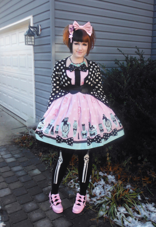
The biggest gripe I've heard is "It's just a black colorway of a sweet print". I can understand this sentiment. To me, in order for an outfit to be bittersweet, there's got to be a little more "bitter" to it than just a black colorway. I would define Bittersweet as having strong contrasts of pastels and black, in relatively equal proportion, occasionally intermixed with gothic themes such as skulls, bats, eyeballs, etc.

To illustrate, here I have two sets I made on Polyvore, involving the same AP print Toy Parade in a black colorway, as well as some example co-ords I've found.

Bittersweet


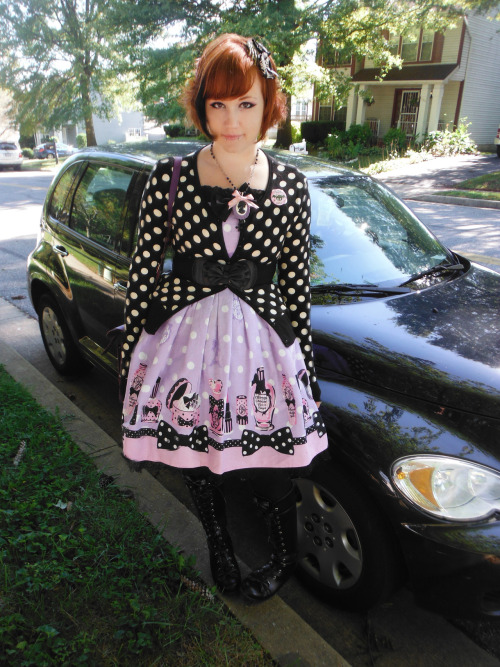
This is what I consider Bittersweet. It's coordinated primarily with black accessories, and there's an extra "punky" touch with some cute Doc Martens. The other two examples also have a darker edge to them than most Sweet lolita- heavier make-up, funky hair, big boots, etc. You can also use a non-black colorway if there's elements in it that let you coordinate it with black (one the reasons I love Fantastic Dolly so much).

Sweet


The second set is straight-up Sweet lolita. Simply a black colorway with traditionally sweet accessories. The overall feel of the two examples is still Sweet, and lack a "bitter" twist to them.

As I mentioned earlier, I don't think bittersweet even has to include a black colorway. Or a print at all (for a non print example, there this post I made about adding Bittersweet to a Gothic wardrobe last year).
Here are some examples I've worn. Have I mentioned I'm obsessed with Fantastic Dolly?
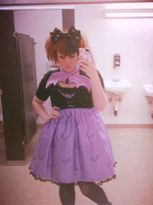

Basically, if your coord floats somewhere in a candy-coated netherworld between Sweet and Gothic, it might be called Bittersweet.

Wednesday, January 16, 2013

Cheating on Gothic with Sweet


I’m sure those of you that pay any attention to my OOTDs and such have noticed the pink and purple creeping into my wardrobe. This influx of sweetness doesn’t mean I’m leaving gothic lolita and will sell my pile of black on black on black dresses. I’ve just…fallen out of love a little. I wore fairly strict Victorian-influenced gothic coords, black with bits of crimson or patterning, almost everyday for several years. But now looking like a lady in mourning just doesn’t quite make my heart flutter quite the same way. I needed a breath of fresh air. That’s why the trends of Bittersweet and Creepy Cute have been particularly appealing to me. Sometimes I don’t want to be the evil queen, I want to be the pretty princess.
It’s not that the cute influence has come from nowhere. I got into goth pretty early in life, and thusly my wardrobe has always leaned heavily on black. So most of my time I’ve been the girl wearing all black with a random bright pink cellphone or other accessory. The love of bright colors and Hello kitty was always there, I just chose my passion for dark clothing over it and let my desire for cute out in random places.
But especially since I’ve gotten into Lolita, I’ve begun to see that clothes…are clothes. And plenty of people wear an elegant Gothic Lolita outfit one day and an OTT Sweet one the next. I am not betraying my identity if I let myself play around with pastels. I still love The Cure and vampires and bat tattoos and going to the old school Goth night at the club. Wearing a pink cardigan won’t change that.
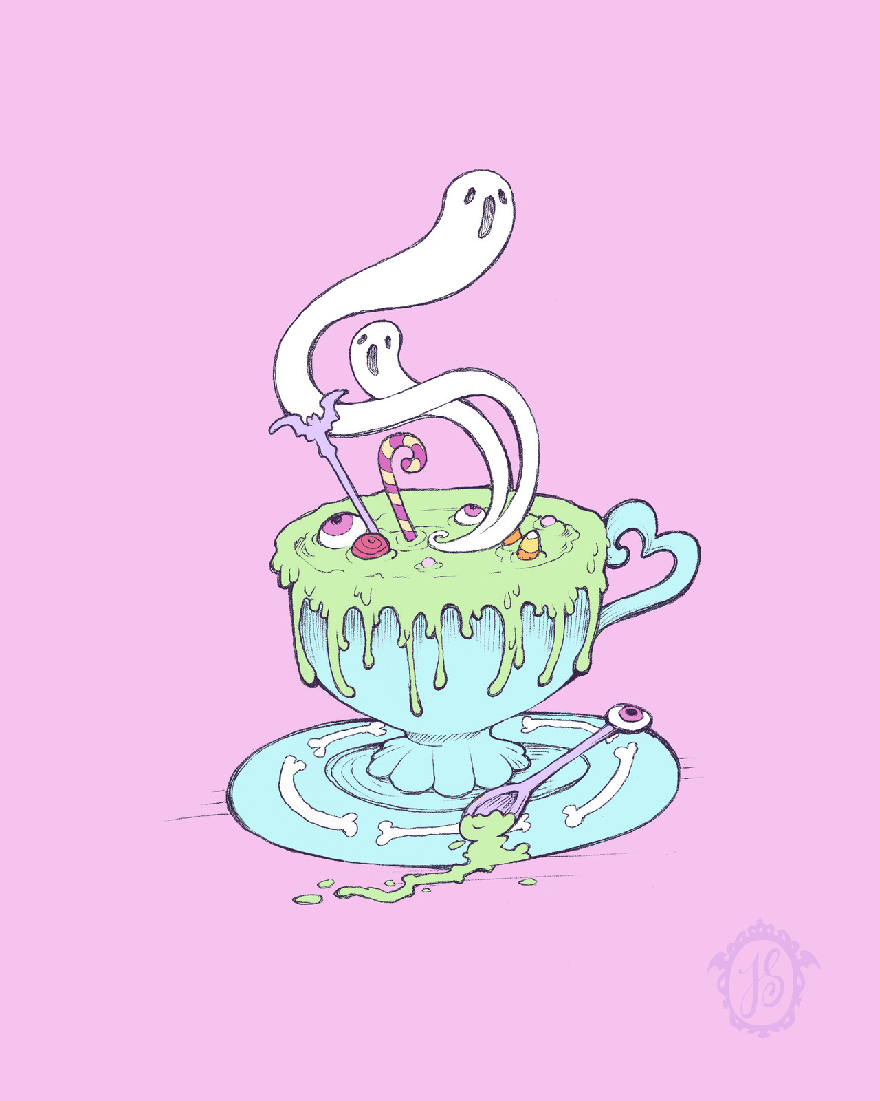
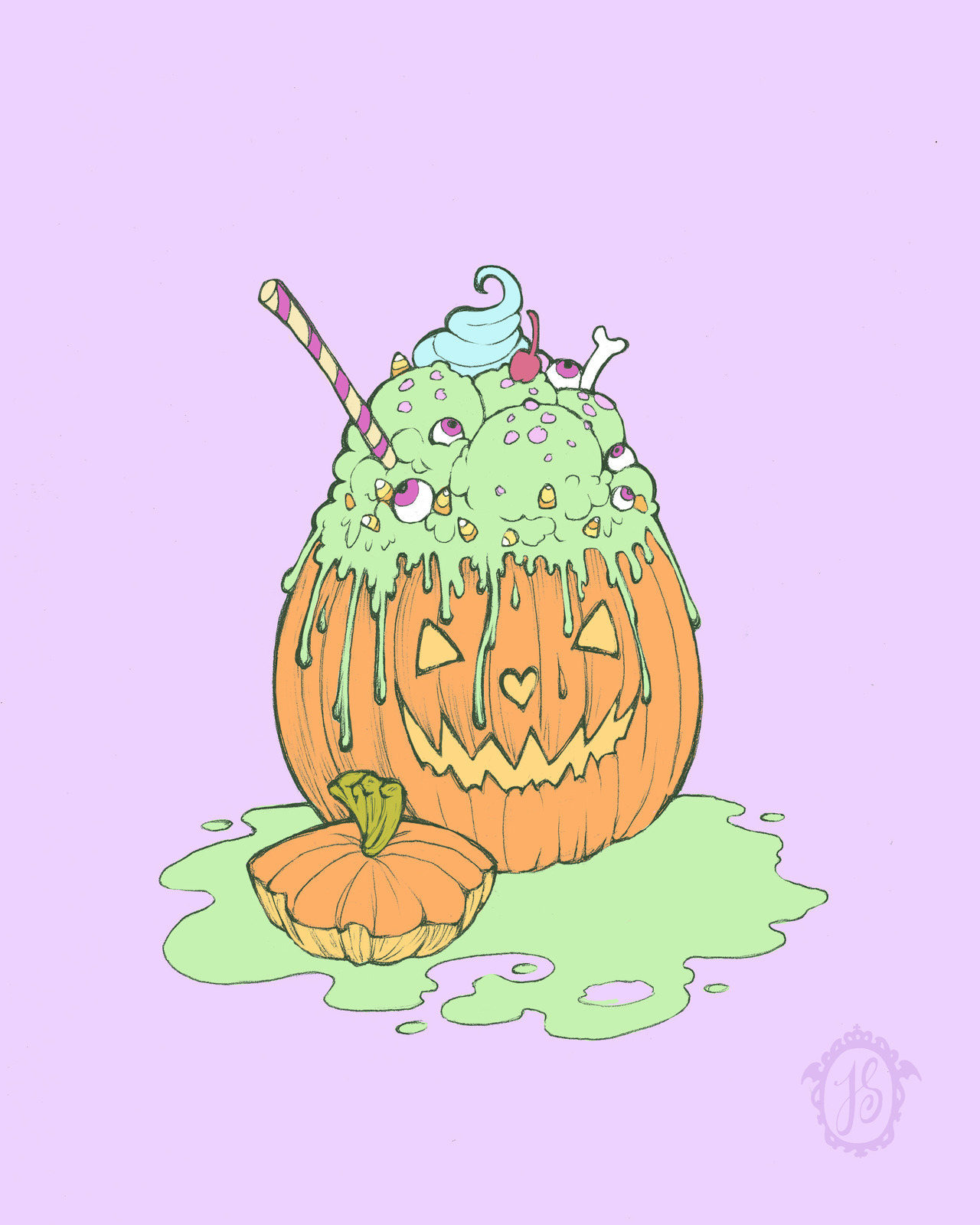
And as I said, I’m not breaking up with Gothic. We’ve just decided to be in an open relationship.


Wednesday, November 28, 2012

Review: Sourpuss's Housewares


   Sourpuss Clothing has long been a favorite company of mine, ever since I discovered them a couple years ago when I bought a set of pink leopard-print plates for my first apartment. Since then, I've filled my home with all kinds of products from them- dresses, sweaters, accessories, and more (some co-rds here and here for example). So when a couple weeks ago Calyn from Sourpuss contacted me and asked if I would do a review for a few of Sourpuss's new housewares, I was delighted to oblige!
  I was super excited to receive a big skull-taped box with two products featuring the "Lady of the Woods" design. If you've seen my artwork before, you'll know how excited I was to see a tattoo-style deer lady.
  The three images for this series are very reminiscent of the classic american tattoo style, with a limited palette of bold colors, simple shading, and strong lines. But there's a little bit of spooky Victorian/turn of the century detail added in. Overall, these otherworldly ladies make for an eye-catching and iconic design.
 (click images to enlarge)


They were also kind enough to send me a few cute stickers and a little bottle-opener keychain. 
I'm getting quite a collection of these! With every order I've gotten new and different stickers. 
Gotta collect 'em all. 


First, we have the Lady of the Woods porcelain tumbler (available here). As my roommate remarked, it's basically a coffee mug minus the handle, plus a lid. It kept my hot chocolate nice and toasty during the course of this review. The porcelain is a solid weight with a crisp, clean image print. The lid a flexible rubber version of a common disposable coffee lid. Despite not clicking/locking on like some portable coffee mugs, it creates a pretty tight seal that didn't leak when tilted side-to-side.

The website says it is microwave-safe, but I couldn't seem to find any information on the box or tumbler as to whether it was dishwasher safe. Judging by the style of printing, I went on the safe side and hand-washed it. There was no discoloration or damage from gently washing with dish soap and hot water.


For an even more woodsy morning, next up we have the matching Lady of the Woods throw pillow (available here). The first thing I noticed was how high quality and soft the fabric is. The beige satin as a base give the artwork a lovely antiqued look. Unlike a lot of pillows, the image was printed in a way so that it is not raised or on top of the fabric. Therefore, it's perfectly smooth to the touch and doesn't have a rough or sticky texture. It's a decent size too, large enough to lay your head on (or for the cat to sit on the moment you take it out of the box). Around the edges is a black pom pom trim, and the back is black cotton with a hidden zipper to remove the cover for washing.  
It matches our Victorian armchairs perfectly!


Though clearly this design is my favorite, they have two other gorgeous classic tattoo designs also available as tumblers, plates, and pillows. "Arctic Fox" and "Harlow". Go check out their site for some great christmas gifts or a little somethin' for your own lair :)

Sunday, November 18, 2012

Tutorial: Pixel Sprites and Jewelry!


 Have a few hours to do something cute and fun? Pixel art and crafts made with Perler beads is little effort with high reward. You can even do it while catching up on whatever shows you kids are watching these days (I think this entire batch was done during rewatching the first season of Dr. Who). It's pretty darn addicting, and relatively cheap once you have your basic items.

So get your Netflix queue up and gather these supplies:
-Assorted plastic Perler or Hama beads
- Pegboard
-Tweezers
-Iron
-Wax paper

Hama beads are basically just smaller Perler beads, so it's up to personal choice which you'd like to use. In my experience, Perler beads are easier to find in the US. You should be able to find them at most art and craft stores. I would not recommend buying the buckets of assorted beads. It is a pain in the butt to pick out the individual colors one by one. 1000 bead packs of one color can be ordered online here if you can't find them in-store.
 
With a google image search, you can find pretty much find any sprite you want. Once you've got everything in order, start out by making your basic outline (there's not exactly a wrong way to go, but it's easier to make sure the shape is right and make necessary changes this way, before jumping into the inside). If you're having trouble eyeballing, count the pixels in rows. Also, I really don't recommend trying this without tweezers. Just save yourself the heartbreak and get a pair.

(click photos to enlarge)


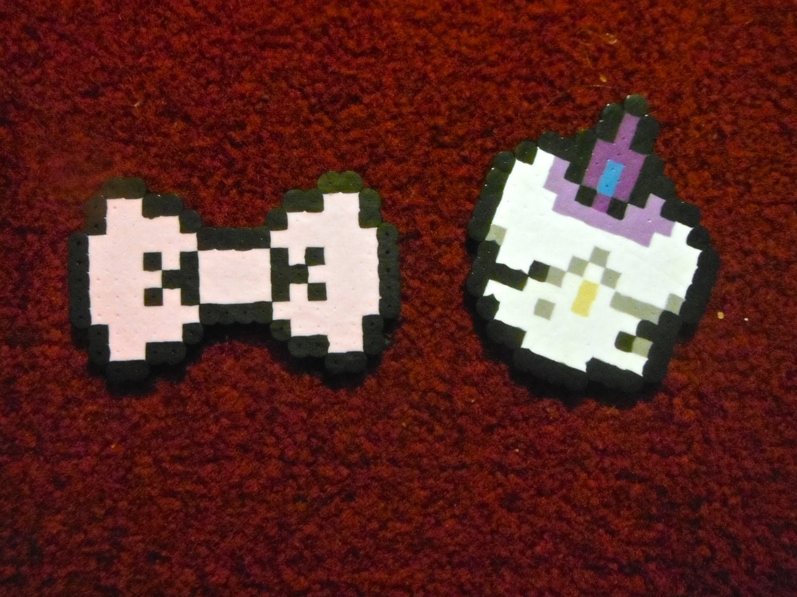
I decided to make a Litwick c:
Once the outline is done, fill in the smaller details.


Finally, the solid color.


 Now take a sheet of wax paper and go over it with the iron for about 20 seconds. If you press down a bit and slowly move from side to side, you can achieve a more solid, smooth look. Make sure the iron is not on the steam setting. When it's done, it will have a wet look and stick to the wax paper.
After the sprite has cooled, flip it over and iron the other side to make it more stable.


It's very easy to make jewelry as well. A bit of hot glue and a pin back, and you've got a nifty pixel brooch. The holes in the beads lend themselves to easily making necklaces (if the holes in the corner have sealed closed, use a pin to reopen them).


Here's me wearing a Minish Cap keese sprite necklace :> With my boyfriend bein' a creep in the background.

Saturday, November 10, 2012

Sugary Sweet Thesis

I hope everyone had a great Halloween. I was Minnie Mouse ;)
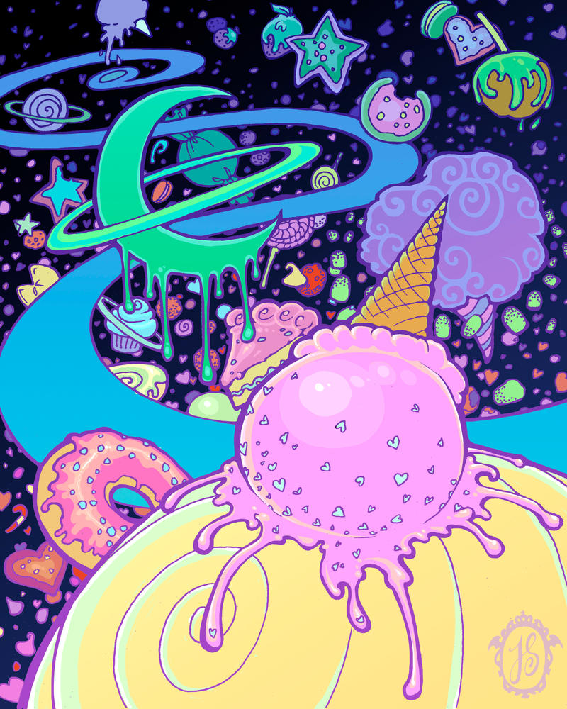
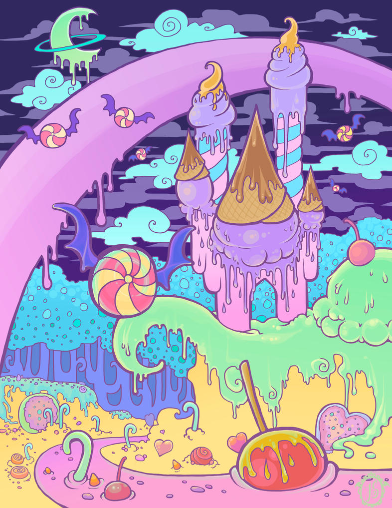
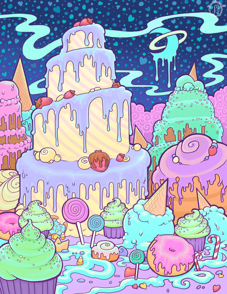
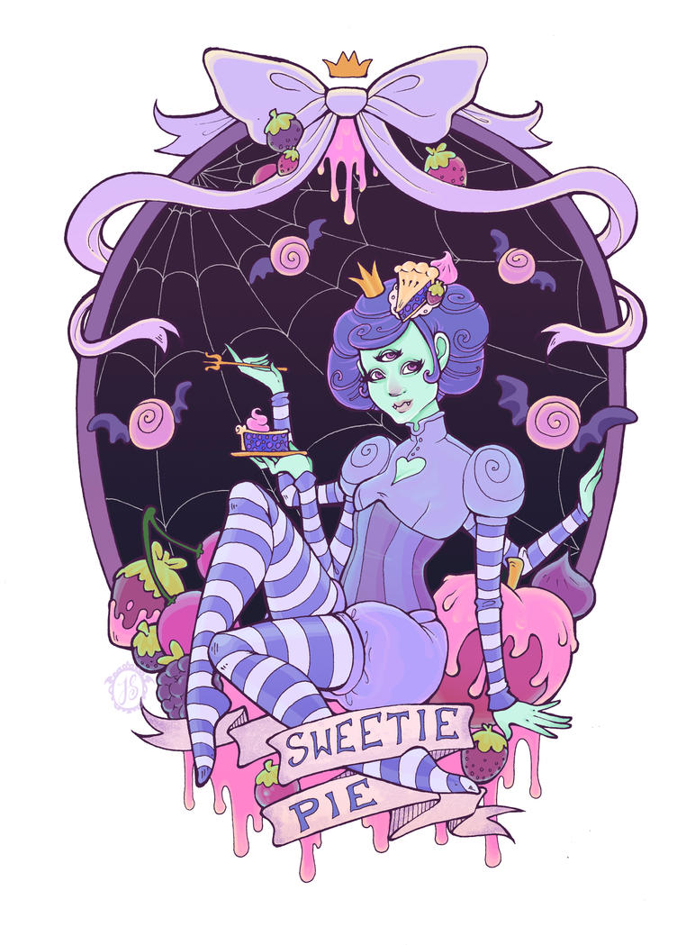
But anyway! If anyone's been wondering where I disappeared to again, it's mostly been my senior year of college (scary!). For my Illustration thesis I elected to do a series of drawings having to do with a candyland creepy-cute universe. "Bittersweet" if you will. Many of these were inspired by AP's OTT sweet prints as well as Adventure Time and, more recently, Wreck-It Ralph :)
I'll be selling these drawings as prints by the end of the year, as well as possibly a line of t-shirts and tote bags.
I started by doing a little monster girl, then wondering "what kind of world would she live in?"

(click to enlarge)


So I did three dessert themed over-the-top environments.


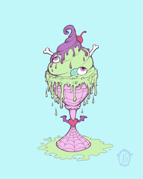
Then I took a break and worked on a little line of spooky food postcards in honor of Halloween.


Now I am working on three character based spot illustrations. These will most likely end up as t-shirts. I only have one completed at the moment, but the others are nearly ready! 


I'd love feedback from you guys c:
Which are you favorites? What would you like to see next?
Related Posts Plugin for WordPress, Blogger...